A collection of inclusive, cross-functional UX & UI resources, infrequently curated by Jennifer Strickland
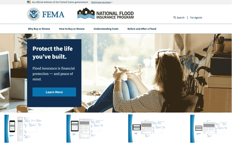
2017 FEMA FloodSmart.gov Responsive Redesign
Role: Senior UX Designer (Researcher, Strategist, Information Architect, Prototyper)
Responsibilities: User Research, Strategy, Content Strategy, IA, UX design, prototyping, mentor junior staff, technical documentation
Audience: a wide range of American property owners looking for information on the National Flood Insurance Program
Challenge: FloodSmart.gov was hacked in 2016. To make the content available FEMA put the content on FEMA.gov in a series of toggles without consideration of user needs. It was dense, written in governmentese, and tough to navigate. This project’s directive was a responsive redesign with a 100% focus on users.
Hindrance: The task order chronology prevented formal user research ahead of design and a full content rewrite.
Actions:
- Prioritize the voice of the people. Conducting “guerrilla” user research through condensed Optimal Workshop card sorts and surveys we leveraged our social networks to locate property owners, especially those in known flood zones, to define taxonomy and organize content. This defined the taxonomy, and informed copy editing existing content using plain language.
- Augment accessibility and performance to elevate the user experience. While the client reviewed moodboards, I created responsive, HTML wireframes to speed up the process. Using screenshots, we presented lo-fidelity wireframes [3.9MB PDF]. This served multiple purposes, as it was my first meeting with the clients, and opportunity to understand their perspective. The deck is annotated to facilitate understanding of what the project would do, uncover what the stakeholders thought it would do, so we could align work. We used static screenshots instead of the responsive wireframes, in order to focus attention on the content.
- Using PlainLanguage.gov as a guide, make the site easy to read and understand. We captured the results of a content audit in GatherContent, and the client reviewed and revised content to be included in the redesign.
- Implement user-centered mobile-first best practices with a test-driven design approach. With approved mood boards and content, the design phase began. During design I “pair-programmed” with a visual designer, taught responsive web design, accessibility best practices, and test-driven design. We provided a static design deck [5.4MB PDF + links to HTML/CSS/JS prototypes] paired with links to a responsive prototype.
- Ensure optimal UX by teaching staff how and what to test. For design handoff, we paired a responsive prototype with documentation including key (web) performance indicators, accessible code specs and samples, plus training on how to regularly measure user experience.
- Foster user empathy with government stakeholders and developers. Using storytelling based on research. My proudest moment was when the Chief of Communications noted the “Need Help?” page looked plain, then pointed at me and said, “when I think of the user, it needs to be quickly easy to read, understand, and get me where I need to go, so this is great. We don’t need big pictures here.”
Result: In May 2018, the refreshed FloodSmart.gov launched – “For Consumers” – with best practices, ADA compliance, and a user-centric approach. Before, when the content was housed in FEMA.gov toggles, there were very few visitors, and they quickly left the site without navigating further. In the first three months of launch, June–August 2018, there were nearly 1.5 million unique visitors, with very little time on the homepage, most of the traffic went to learning more about how flood insurance protects their investment and how to buy flood insurance.
The “For Agents” site was done by an entirely different team.